Creating a Mobile Sticky Menu in Elementor Without Code
Native WordPress menus weren’t designed for the thumb-friendly navigation mobile users expect. This tutorial from Future Pedia walks through building a sticky bottom menu bar in Elementor — icon-based, app-style, and fully responsive — without writing a single line of code. By the end, you’ll have a fixed footer menu that appears only on tablets and phones, complete with tap animations and per-page display conditions.
1. Create a new Sticky Footer template in Elementor. Open the Elementor editor and start with a blank template. The Elements panel on the left sidebar exposes the Site widgets you’ll need — specifically the Icon and Heading widgets. Add a new section to the canvas that will become your footer menu container.

2. Style the section background and shadow. In the Edit Section panel, switch to the Style tab and set the background color to white (#FFFFFF). Then open Border > Box Shadow and configure an upward shadow: Horizontal 0, Vertical -12, Blur 32, Spread 0, Position Outline. This gives the bar a subtle floating effect that visually separates it from page content.
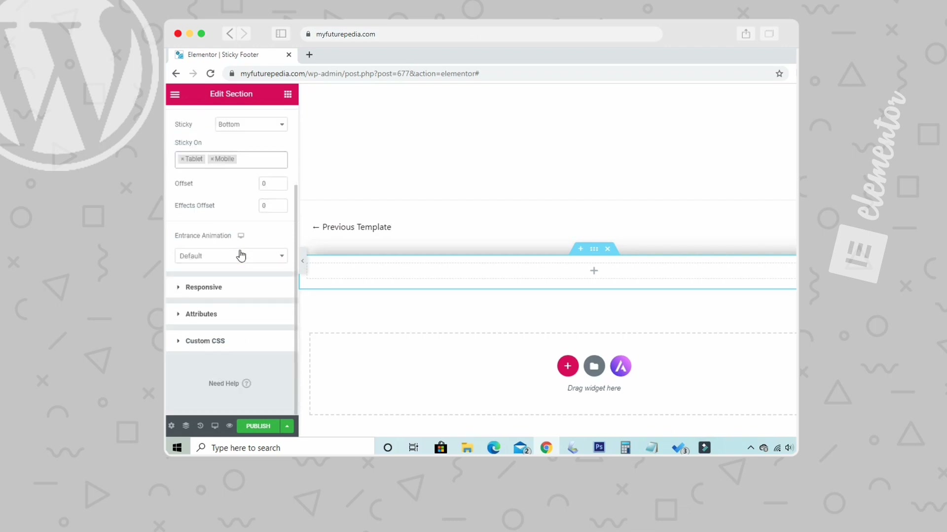
3. Make the section sticky on mobile devices. This is the critical step. Navigate to the Advanced tab of the section settings, find the Sticky option, and set it to Bottom. Under Sticky On, enable only Tablet and Mobile — leave Desktop unchecked. This locks the menu bar to the bottom of the viewport on smaller screens while keeping it hidden on desktop.
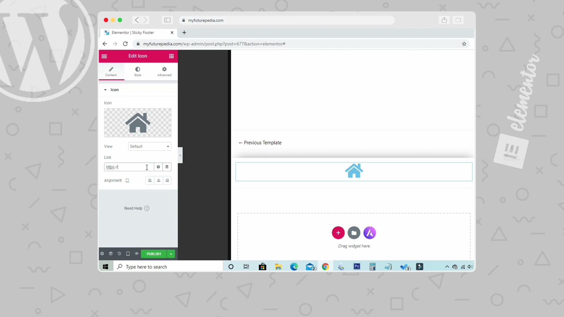
4. Add and configure your first icon. Drag an Icon widget into the section. Select a home icon from the icon library, then paste your homepage URL into the Link field. Set alignment to center so the icon sits evenly within its column.
5. Set a hover animation for tap feedback. While still editing the Icon widget, switch to the Style tab and open the Hover Animation dropdown. Select Pop — it provides a satisfying visual response when users tap the icon on mobile.
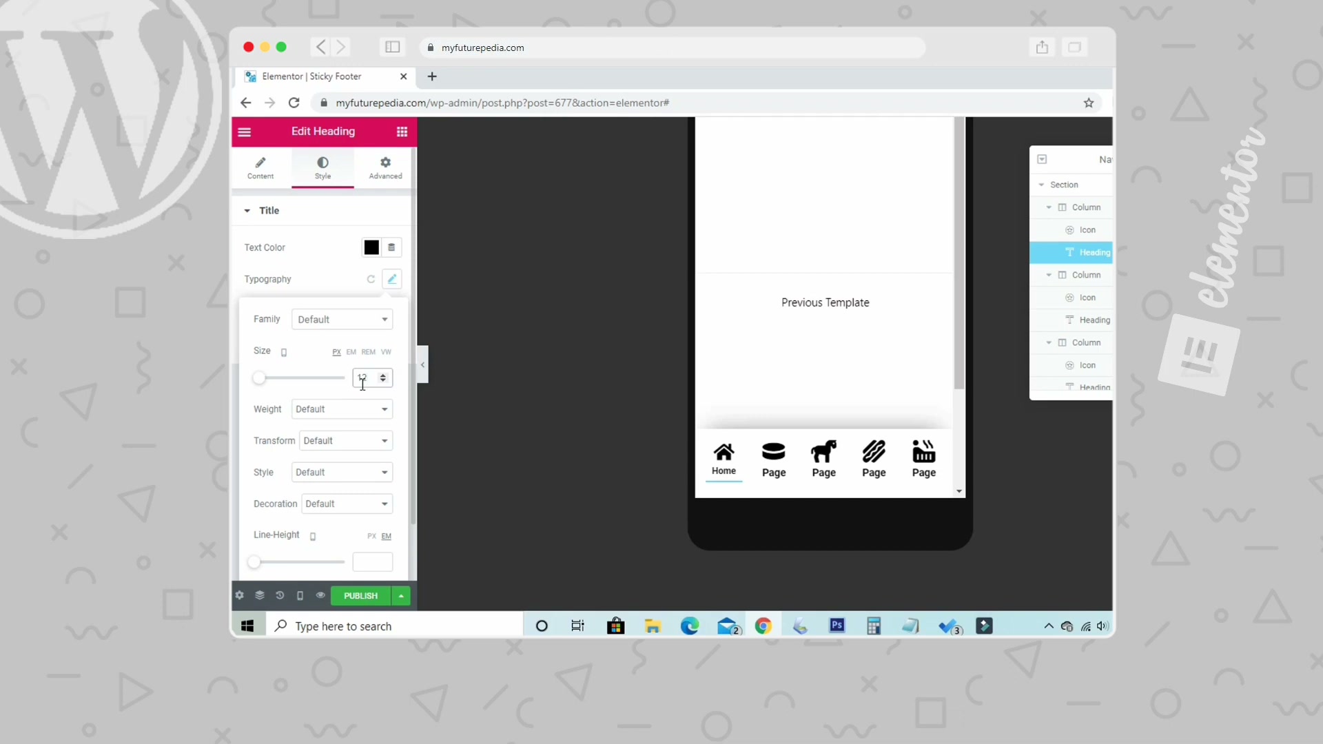
6. Add a label beneath the icon. Drag a Heading widget directly below the icon. Type Home as the title text and set the HTML tag to H2. Adjust the top margin in the Advanced tab to tighten the gap between the icon and label, creating a compact icon-plus-text menu item.
Warning: this step may differ from current official documentation —
see the verified version below.
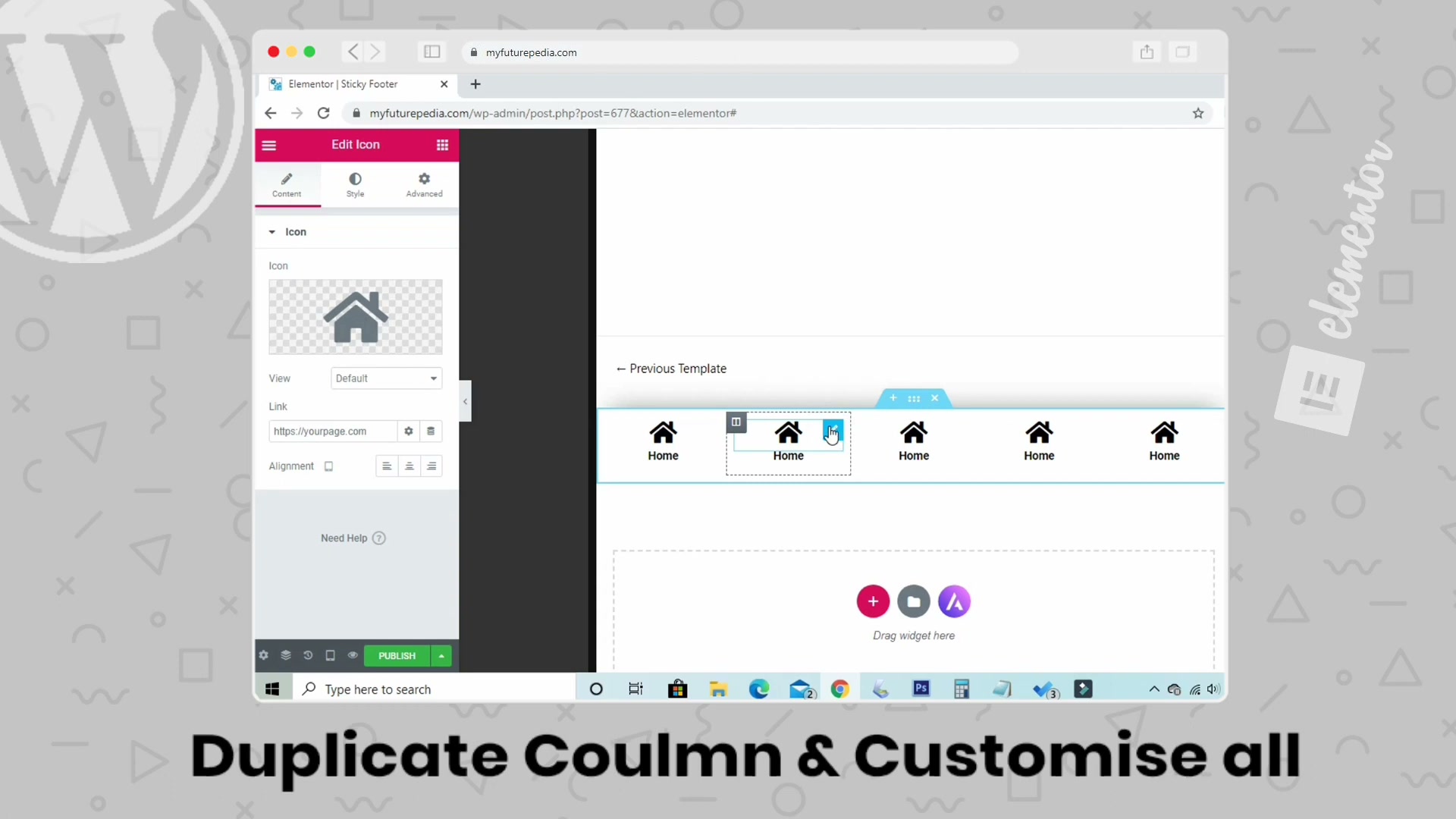
7. Duplicate the column to build out the full menu. Right-click the column containing your icon and heading, then select Duplicate. Repeat until you have five columns spanning the section. Customize each duplicate with a unique icon (pages, cart, search, account) and the corresponding label text and URL.
8. Preview in mobile responsive mode. Open the Navigator panel to verify the section structure — each column should contain one Icon and one Heading widget. Switch to Mobile preview (360px) at the bottom of the editor to confirm the five items space evenly across the screen.
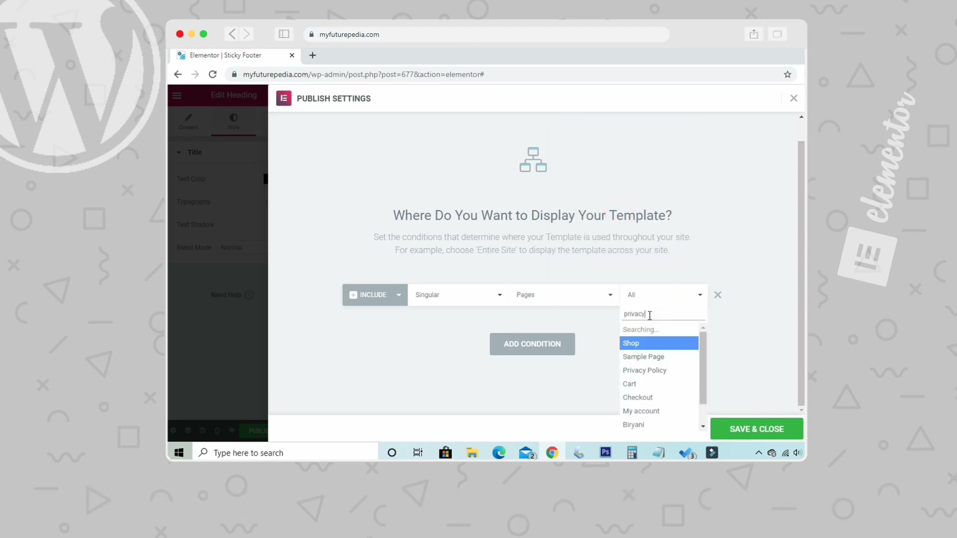
9. Set display conditions and publish. Click Publish and configure your display conditions. Under INCLUDE, select Singular > Pages, then choose which pages should show the sticky menu. This keeps the menu off your blog archive or other layouts where it doesn’t belong.
How does this compare to the official docs?
Elementor’s documentation covers sticky sections and display conditions through separate guides — the next section reconciles those official references with the specific workflow shown here.
Here’s What the Official Docs Show
Act 1 walked through a practical, step-by-step build of a sticky mobile menu in Elementor — a useful workflow worth following. For this verification pass, however, our documentation screenshots captured the Elementor marketing homepage rather than the Help Center articles, so none of the nine steps above could be confirmed or corrected against official docs. Every step below carries an unverified flag; treat the video as your primary guide and cross-check each setting in Elementor’s Help Center before going live.
1. Create a new Sticky Footer template in Elementor.
No official documentation was found for this step —
proceed using the video’s approach and verify independently.
2. Style the section background and shadow.
No official documentation was found for this step —
proceed using the video’s approach and verify independently.
3. Make the section sticky on mobile devices.
This is the linchpin of the entire build. Elementor’s Help Center maintains a dedicated article on sticky sections covering the Advanced → Sticky toggle and per-device controls. The video’s instruction to set Sticky to Bottom and enable only Tablet and Mobile is consistent with Elementor’s documented sticky behavior, but we were unable to capture that page for direct confirmation.
No official documentation was found for this step —
proceed using the video’s approach and verify independently.
4. Add and configure your first icon.
No official documentation was found for this step —
proceed using the video’s approach and verify independently.
5. Set a hover animation for tap feedback.
No official documentation was found for this step —
proceed using the video’s approach and verify independently.
6. Add a label beneath the icon.
Act 1 flagged this step as potentially diverging from the docs. Elementor’s widget documentation typically recommends the Heading widget for semantic labels, so the video’s approach is reasonable. Confirm the correct HTML tag (H2 may be semantically heavy for a nav label — H6 or a plain Text widget could be more appropriate) by reviewing the Heading widget article in the Help Center.
No official documentation was found for this step —
proceed using the video’s approach and verify independently.

7. Duplicate the column to build out the full menu.
No official documentation was found for this step —
proceed using the video’s approach and verify independently.
8. Preview in mobile responsive mode.
No official documentation was found for this step —
proceed using the video’s approach and verify independently.
9. Set display conditions and publish.
Elementor’s Theme Builder relies on display conditions to control where templates render. The video’s instruction to select Singular → Pages and pick individual pages aligns with how Elementor’s condition logic is generally structured, but the specific UI may have changed across Elementor versions.
No official documentation was found for this step —
proceed using the video’s approach and verify independently.
Useful Links
- Elementor Help Center — Central hub for all official Elementor documentation, including widget guides and theme builder tutorials
- Sticky Section — Elementor Help — Dedicated article covering sticky positioning options, per-device toggles, and offset settings
- Display Conditions — Elementor Help — Official guide to include/exclude rules that control where templates appear on your site
- Icon Widget — Elementor Help — Documentation for the Icon widget covering library selection, link fields, alignment, and hover animations
- Heading Widget — Elementor Help — Reference for the Heading widget including HTML tag options, typography controls, and spacing settings
- Elementor Homepage — Main Elementor site for pricing, feature overviews, and getting started with the page builder


0 Comments