

Platform algorithms are ruthless about dimensions. Submit the wrong size and your content gets cropped, letterboxed, or downranked before a single human sees it. This guide gives you every current image and video dimension for Instagram, Facebook, X, LinkedIn, TikTok, YouTube, Pinterest, Bluesky, Threads, and Snapchat — plus a step-by-step workflow for building a production-ready asset library that scales across all of them.
What This Is
The Hootsuite Social Media Image Sizes Guide is the most comprehensive publicly maintained reference for platform-specific image and video dimensions. Published April 1, 2026, it covers exact pixel dimensions, aspect ratios, file size limits, and format recommendations across every major network — including newer entrants like Bluesky and Threads that many legacy guides still ignore.
This isn’t a stylistic preference document. It’s a technical specification reference. Every platform has a rendering engine that resizes, crops, and compresses uploads based on its own rules. When you submit an image outside the recommended dimensions, one of several things happens: the platform auto-crops (often removing faces or key text), adds black bars (which signals low-effort content to the algorithm), or downgrades rendering quality by forcing upscale from a smaller file.
According to the 2026 AI Visual Content and Social Media Strategy Briefing — produced via NotebookLM deep research — the shift to vertical content formats is no longer optional. Platforms including Instagram, Facebook, Threads, and LinkedIn have algorithmically standardized around the 4:5 portrait ratio (1080 × 1350 px) for feed content, while immersive video formats on TikTok, YouTube Shorts, and Reels have unified around 9:16 (1080 × 1920 px). The research report states plainly: “The 4:5 ratio isn’t just a suggestion; it’s practically a requirement.”
Understanding these specs matters beyond aesthetics. Screen real estate directly correlates with attention. A 4:5 image occupies roughly 56% more vertical space in a feed than a 16:9 landscape image. More space means more time in frame during scroll. More time in frame increases the probability of engagement signals — saves, shares, comments — that train the algorithm to distribute your content further.
The technical baseline has also shifted. According to the research briefing, legacy display technologies have been superseded by HDR panels, Wide Color Gamut, and OLED, making the traditional 8-bit JPEG insufficient for professional-quality output. Next-generation formats like AVIF and JPEG XL are now the standard for web delivery, with AVIF offering superior compression and HDR support and JPEG XL enabling progressive rendering and lossless conversion from existing JPEG archives.
For practitioners managing content across multiple platforms, the practical challenge is building a system — not just knowing the numbers. A single photoshoot or design session needs to produce assets for 6-10 different dimension configurations without requiring a complete redesign for each. That’s what the tutorial section of this guide addresses.
Why It Matters
Getting image dimensions wrong is one of the most consistently overlooked performance killers in social media marketing. Practitioners who deploy across multiple platforms daily know this viscerally: a campaign built around a 16:9 hero image that runs on Instagram Reels will have its sides cropped into oblivion. A LinkedIn post image built at 1200 × 628 px will be displayed smaller and less prominently than one built at 1080 × 1350 px in the current feed layout.
The research briefing documents a specific shift at Instagram: “The platform now favors the 4:5 ratio so heavily that square posts are often perceived as smaller and less engaging. Even the profile grid is transitioning to a ‘tall grid’ (3:4 aspect ratio).” This is a material change for any brand that built its visual identity around square (1:1) content — a format that was dominant from roughly 2014 through 2022.
There are three categories of practitioners most affected:
Social media managers at agencies — you’re producing content for 5-15 clients simultaneously. Without a standardized dimension template system, you’re either creating redundant files or publishing suboptimal sizes by default. The time cost is real and the quality hit is measurable.
In-house marketing teams at e-commerce brands — product photography pipelines need to be built with multi-platform output in mind from the shoot stage, not the export stage. A product shot framed for landscape will require a reshoot (or expensive reframing in post) to perform in a portrait-first feed.
Solo creators and personal brands — you’re managing production yourself, which means every hour spent on asset resizing is an hour not spent on content quality. A proper template library eliminates this entirely.
Beyond workflow efficiency, there’s the technical quality argument. As the research briefing notes, adopting next-gen formats like AVIF can “deliver significantly smaller files than JPEG at similar visual quality, and it often edges out WebP too.” For teams with large asset libraries, this translates to faster load times, better Core Web Vitals scores, and reduced storage and CDN costs — not trivial at scale.
The discovery layer has also shifted. Per the research briefing, 64% of Gen Z and 49% of Millennials now use TikTok as a search engine, while YouTube ended its universal Trending page in July 2025, replacing it with category-specific charts. This means the discoverability of visual content is increasingly tied to platform-native search behavior, where correctly formatted, high-quality assets are table stakes.
The Data: 2026 Social Media Dimensions Reference
| Platform | Format Type | Dimensions (px) | Aspect Ratio | File Size Limit |
|---|---|---|---|---|
| Feed (Best) | 1080 × 1350 | 4:5 | — | |
| Feed (Square) | 1080 × 1080 | 1:1 | — | |
| Feed (Landscape) | 1080 × 566 | 1.91:1 | — | |
| Stories / Reels | 1080 × 1920 | 9:16 | — | |
| Reels (Grid Preview) | 1080 × 1440 | 4:5 | — | |
| Profile Photo | 320 × 320 | 1:1 | — | |
| Threads | Post Image | 1440 × 1920 | 3:4 | 8 MB |
| Threads | Profile Photo | 640 × 640 | 1:1 | — |
| Feed (Portrait) | 1080 × 1350 | 4:5 | — | |
| Feed (Square) | 1080 × 1080 | 1:1 | — | |
| Stories | 1080 × 1920 | 9:16 | — | |
| Cover Photo | 851 × 315 | 2.7:1 | — | |
| X (Twitter) | In-Stream (Landscape) | 1280 × 720 | 16:9 | 15 MB (web) |
| X (Twitter) | In-Stream (Vertical) | 720 × 1280 | 9:16 | 5 MB (mobile) |
| X (Twitter) | In-Stream (Square) | 1080 × 1080 | 1:1 | — |
| X (Twitter) | Header Photo | 1500 × 500 | 3:1 | — |
| Post (Vertical) | 1080 × 1350 | 4:5 | — | |
| Post with URL | 1200 × 627 | 1.91:1 | — | |
| Ad (Vertical Mobile) | 720 × 900 | 4:5 | — | |
| Cover Photo | 1584 × 396 | 4:1 | — | |
| TikTok | Video | 1080 × 1920 | 9:16 | — |
| TikTok | Carousel | 1080 × 1920 | 9:16 | — |
| TikTok | Profile Photo | 200 × 200 | 1:1 | — |
| YouTube | Shorts | 1080 × 1920 | 9:16 | — |
| YouTube | Thumbnail | 1280 × 720 | 16:9 | — |
| YouTube | Channel Banner | 2560 × 1440 | 16:9 | — |
| Standard Pin | 1000 × 1500 | 2:3 | 20 MB | |
| Cover Photo | 800 × 450 (min) | 16:9 | — | |
| Bluesky | Post Image | 1000 px (longest side) | Flexible | 1 MB per image |
| Bluesky | Banner Image | 3000 × 1000 | 3:1 | — |
| Snapchat | Ad / Story | 1080 × 1920 | 9:16 | 5 MB |
| Snapchat | Profile Photo | 320 × 320 | 1:1 | 2 MB |
Sources: Hootsuite Social Media Image Sizes Guide, April 2026; 2026 AI Visual Content and Social Media Strategy Briefing
The unifying pattern: 1080 px wide is the standard for most feed and story formats. As the Hootsuite guide states, “most social platforms still work best with images that are 1080 pixels wide,” particularly for feed and full-screen formats. The height — and therefore the aspect ratio — is where differentiation happens.
Step-by-Step Tutorial: Build a Multi-Platform Asset Library
This is the section that separates practitioners from publishers. Knowing the specs is the easy part. The hard part is building a system where you can take one source asset — a photo, a design, a video — and produce correctly sized outputs for every platform without starting from scratch each time.
Prerequisites
- Design tool with artboard/canvas templates (Figma, Adobe Express, Canva Pro, or Photoshop)
- A file export workflow (manual, Figma plugin, or automated via API)
- Access to the platforms you’re publishing to
- Optional but recommended: a DAM (Digital Asset Manager) or organized cloud folder structure
Phase 1: Establish Your Master Canvas
Step 1: Define your “portrait master” canvas.
Start with 1080 × 1920 px (9:16) as your master canvas. This is the largest format you’ll need for any platform. Every other format you need is either a crop, a resize, or a subset of this canvas.
Set up this artboard in your design tool of choice. In Figma: New Frame → Custom → 1080 × 1920. In Canva Pro: Custom Size → 1080 × 1920. In Photoshop: New Document → Width 1080 px, Height 1920 px, Resolution 72 PPI for screen, 300 PPI if you also need print.
Step 2: Identify your “safe zone.”
Per the research briefing, for Stories, Reels, and Shorts, keep all critical elements — faces, text, logos, calls to action — within a centered 1080 × 1420 px safe zone. The top and bottom ~250 px of a 9:16 frame are typically obscured by platform UI: the account name and follow button at the top, the caption and like/share tray at the bottom.
In Figma, create a centered rectangle at 1080 × 1420 px, give it a transparent fill with a visible stroke, and lock it on its own layer labeled “SAFE ZONE — DO NOT PLACE TEXT OUTSIDE.” This layer does not get exported. It’s a guide only.
Step 3: Design to the safe zone, not the full canvas.
Place all key visual elements, text overlays, product shots, and logos inside the safe zone. The areas above and below the safe zone can have background color, texture, or visual elements that extend the composition — they just can’t contain information you need the viewer to read.
Phase 2: Create Derivative Artboards
Step 4: Create a 4:5 artboard from the master.
Add a second artboard at 1080 × 1350 px (4:5). This is your Instagram feed best, Facebook feed portrait, LinkedIn post, X vertical, and Threads primary format — according to both Hootsuite and the research briefing.
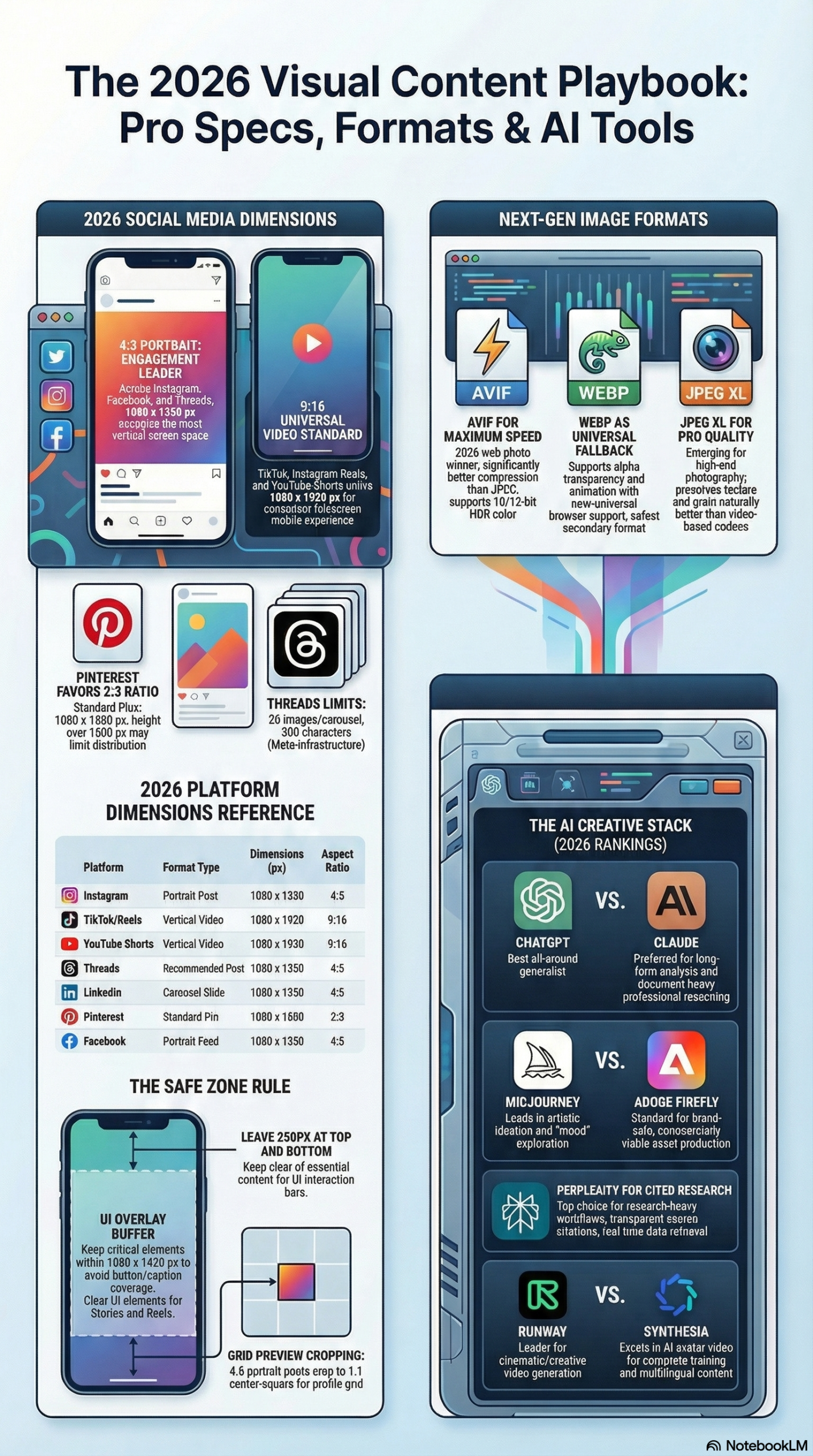
Copy your design from the 9:16 master. The 4:5 canvas is essentially a center-crop of the 9:16. The safe zone content will fit. Adjust any composition elements that look imbalanced after the crop.
Step 5: Create a 1:1 artboard.
Add a third artboard at 1080 × 1080 px (1:1). Square format is still relevant for Instagram feed (as a fallback), Facebook feed, and profile photos. It also works well for carousel slides. This is a tighter center-crop of the 4:5 canvas.
Step 6: Add platform-specific artboards as needed.
For platforms with unique specs, create dedicated artboards:
- Pinterest Pin: 1000 × 1500 px (2:3) — Pinterest is still portrait-first but at a different ratio. Text overlays perform strongly here.
- YouTube Thumbnail: 1280 × 720 px (16:9) — this is your only legitimate landscape use case in most content workflows.
- LinkedIn Cover / Facebook Cover: These banner formats (1584 × 396 and 851 × 315 respectively) require completely separate horizontal designs. Don’t try to adapt portrait content to these.
- Bluesky Post: Use 1000 × 1000 px as a safe default; the platform is flexible but caps each image at 1 MB, so compress aggressively.
Phase 3: Build a Template System
Step 7: Save each artboard as a named template.
In Canva Pro, save each sized design as a template in your Brand Kit. In Figma, use Components to create a master layout that you can detach and customize per campaign. In Photoshop, use Smart Objects: place your photography or video frame as a Smart Object, then update the source file and all derivative sizes update simultaneously.
Name your templates with a platform/format naming convention:
– IG-Feed-4x5-Template
– IG-Story-9x16-Template
– FB-Feed-4x5-Template
– YT-Thumbnail-16x9-Template
– PIN-Standard-2x3-Template
Step 8: Build a batch export configuration.
In Figma: use the Batch Export plugin or the built-in multi-artboard export (File → Export → select all artboards). In Photoshop: use File → Export → Export As for each artboard, or write an Action script that exports all artboards to a designated output folder with platform names in the filename.
For teams using automation tools, the Canva API and Adobe Express API both support programmatic template population — you can pass in a product image, headline text, and brand color, and get back correctly sized exports for every platform in a single API call.
Step 9: Implement a file naming convention.
Output files should follow a pattern that makes platform, format, and campaign immediately readable:
[CampaignName]_[Platform]_[AspectRatio]_[Version].[ext]
Example:
SpringSale2026_IG_4x5_v1.jpg
SpringSale2026_IG_9x16_v1.jpg
SpringSale2026_YT_16x9_thumb_v1.jpg
SpringSale2026_PIN_2x3_v1.jpg
This makes it trivially easy for schedulers or VAs to pull the right file without checking dimensions manually.
Phase 4: Export Formats and Compression
Step 10: Choose the right output format per context.
Per the research briefing, the technical standard for web delivery has shifted significantly:
- AVIF: Use as your primary web export format for static images. It offers superior compression and HDR support compared to JPEG and WebP. Most modern browsers support it. Platform upload pipelines will re-compress anyway, so feed it the highest quality source you can.
- JPEG XL (.jxl): Ideal for your master archive files. It supports progressive rendering and lossless conversion from existing JPEG libraries. Use it as your “digital negative” format.
- WebP: Fallback for browsers that don’t support AVIF. Still significantly better than JPEG for web delivery.
- JPEG: Final safety net for legacy contexts and platform requirements that mandate it.
- PNG: Use only for images with transparency (logos, overlays). PNGs are substantially larger than AVIF or WebP for photographic content.
- MP4 (H.264/H.265): Standard for social video. H.265 at higher compression settings for TikTok and Reels where file size matters.
Step 11: Verify dimensions before scheduling.
Before uploading to your scheduling tool (Hootsuite, Buffer, Sprout Social, or directly to platform), run a quick dimension check. On macOS, select the file in Finder and press Cmd+I. On Windows, right-click → Properties → Details. Or use a simple script:
# Quick dimension check via ImageMagick (macOS/Linux)
identify -format "%f: %wx%h\n" *.jpg

# Or using Python + Pillow
from PIL import Image
import os

for f in os.listdir('.'):
    if f.endswith(('.jpg', '.png', '.webp')):
        img = Image.open(f)
        print(f"{f}: {img.size[0]}x{img.size[1]}")
Expected Outcomes
After completing this workflow, you will have:
– A master 9:16 canvas and derivative artboards for every major platform
– A template library you can reuse across campaigns by swapping content
– A naming convention that eliminates confusion in distributed teams
– An export pipeline that produces correctly sized, appropriately compressed files every time
The per-campaign asset production time should drop from 2-4 hours to 20-40 minutes once templates are established.
Real-World Use Cases
Use Case 1: E-Commerce Product Launch
Scenario: A DTC skincare brand is launching a new serum. The campaign runs across Instagram, TikTok, Pinterest, and Facebook. The hero asset is a studio product shot.
Implementation: The product photographer shoots in RAW on a portrait orientation with the product centered in a clean background. The art director exports the master at 1080 × 1920 px and builds all derivative crops (4:5 for Instagram/Facebook feed, 9:16 for Reels/TikTok, 1000 × 1500 for Pinterest) from the same source using Figma’s multi-artboard export. Each format gets a platform-appropriate text overlay added within the safe zone.
Expected Outcome: The Instagram 4:5 post occupies maximum feed real estate. The TikTok 9:16 fills the full screen. The Pinterest 2:3 pin drives click-throughs to the product page. No manual resizing required after initial template setup — a new product can be launched across all four platforms in under 30 minutes.
Use Case 2: Agency Managing Multiple Clients
Scenario: A 3-person social media agency manages 12 brand accounts, posting 5-7 times per week per client. Without a dimension system, every post involves manual size checking.
Implementation: The agency builds a shared Canva Brand Kit for each client, with pre-sized templates for every active platform: IG feed, IG story, FB feed, LI post, X post. Each template uses the client’s brand colors, fonts, and logo as locked layers. Content team members update only the photo and copy layers. Canva’s download feature exports all formats in one batch.
Expected Outcome: Design time per post drops from ~45 minutes to ~10 minutes. Dimension errors drop to near zero. The agency can handle 50% more clients without adding headcount.
Use Case 3: Creator Repurposing Long-Form Video
Scenario: A solo creator produces a 20-minute YouTube tutorial. They want to repurpose it as Shorts, TikToks, and Instagram Reels.
Implementation: The original video is shot in 4K 16:9 (3840 × 2160). The creator uses CapCut or DaVinci Resolve’s reframe tool to auto-generate a 9:16 crop that follows the subject’s movement. The final 9:16 export at 1080 × 1920 is uploaded to TikTok and downloaded via the scheduling tool for Reels and YouTube Shorts. A thumbnail is exported at 1280 × 720 for the long-form video.
Expected Outcome: One video shoot produces content for four platforms. The 9:16 exports perform natively on all short-form video surfaces without black bars or algorithmic penalties.
Use Case 4: B2B LinkedIn Thought Leadership
Scenario: A B2B SaaS company publishes weekly carousel posts on LinkedIn featuring data insights and strategic frameworks.
Implementation: Each carousel slide is built at 1080 × 1350 px (4:5) in Figma. The research briefing notes that LinkedIn carousels “consistently yield the highest engagement rates (averaging 45.85% on LinkedIn).” The first slide is the hook — a bold data point or question. Slides 2-8 are content. The last slide is the CTA. Exported as individual JPEGs or as a multi-image upload.
Expected Outcome: Carousel format maximizes feed real estate on mobile LinkedIn. The portrait orientation fills the screen. Engagement rates measurably exceed single-image posts, per the research briefing.
Use Case 5: Bluesky Brand Presence Setup
Scenario: A media company is establishing a presence on Bluesky as the platform continues gaining users post-2025.
Implementation: Per Hootsuite’s specifications, the Bluesky banner is 3000 × 1000 px and the profile photo is 1000 × 1000 px. Post images max at 1000 px on the longest side with a 1 MB per-image file size limit. The team exports post images as AVIF at quality 75 to stay within the size limit while maintaining visual fidelity. Up to 4 images can be attached per post.
Expected Outcome: Clean brand presentation on Bluesky from day one. AVIF compression keeps all post images under the 1 MB limit without visible quality loss.
Common Pitfalls
1. Designing for One Platform, Cropping for All
The most common mistake: a creative team designs a horizontal brand campaign (“16:9 first”) and then tries to adapt it for Instagram, TikTok, and Stories. The result is a forced crop that cuts off faces, product details, and text. The fix: establish 4:5 as your primary canvas at the design stage. Horizontal formats — YouTube thumbnails, Facebook cover photos, LinkedIn banners — are exceptions requiring separate designs, not adaptations of your vertical master.
2. Ignoring the Safe Zone
Uploading a 9:16 video with text placed at the very bottom or top of the frame is a guaranteed way to have your CTAs hidden behind platform UI. As the research briefing specifies, keep all critical elements within the center 1080 × 1420 px of a 9:16 frame. This issue is especially acute on TikTok and Instagram Reels, where the caption, music tag, and engagement buttons overlap significant portions of the frame.
3. Uploading Undersized Files
Uploading a 640 × 640 px image to Instagram and expecting it to look clean at 1080 px display is a miscalculation. The platform upscales and the result is visibly blurry or pixelated. Always upload at the recommended resolution or higher. Platforms will downscale; they cannot add quality that isn’t in the source file.
4. Using JPEG for Everything
Legacy JPEG workflows made sense in 2015. Per the research briefing, 8-bit JPEG is now insufficient for HDR display environments, and AVIF or WebP delivers equal or better visual quality at significantly smaller file sizes. Using JPEG as your only export format means you’re either over-compressing (visible artifacts) or over-sizing (slow loads) compared to modern alternatives.
5. Forgetting Platform-Specific Aspect Ratio Quirks
Threads uses 3:4 natively (1440 × 1920 px), not 4:5. X in-stream images use 1280 × 720 for landscape — not 1920 × 1080. Pinterest’s primary pin format is 2:3 (1000 × 1500 px), not 4:5. These are not interchangeable. Always check the spec table before publishing to a platform you use less frequently.
Expert Tips
1. Use one 9:16 source, export everything. Design your primary visual at 1080 × 1920 px. Every feed format (4:5, 1:1, 9:16) is a crop of this canvas. If your composition works at 9:16, it will work at 4:5 and 1:1 with minor adjustments. This is the single biggest time-saver in multi-platform production.
2. Build AVIF into your export pipeline now. Per the research briefing, AVIF is the emerging standard for web image delivery, offering better compression than WebP and JPEG at equivalent visual quality. Set up your export pipeline to output AVIF as primary, WebP as fallback. Platforms re-compress on ingest anyway, so feed them the highest quality source; AVIF lets you do that at smaller upload sizes.
3. Use Social SEO in your image descriptions. Per the research briefing, 53% of Gen Z turns to TikTok, Reddit, or YouTube before Google when searching for information. Optimizing alt text, file names, and caption keywords for platform-native search — not just hashtags — is increasingly where visual content earns its first impressions.
4. Keep text to 1-2 words for AI-generated images. The research briefing cites official DALL-E documentation noting that the tool “often produces distorted or unintelligible results” for text. Midjourney V7 and Stable Diffusion 3.5 face similar limitations with multi-word text rendering. If your visual requires a readable headline, composite it in your design tool post-generation rather than attempting to prompt it.
5. Separate accounts by cloud device, not browser. For teams managing multiple brand accounts on TikTok or Instagram, the research briefing specifically recommends using cloud-based Android devices rather than emulators to avoid account linking and bans: “Platform algorithms have become highly sensitive to hardware identifiers.” Browser-based account switching through profiles is no longer sufficient for serious multi-account management.
FAQ
Q: Does the 4:5 format actually perform better than 1:1 on Instagram, or is this just a convention?
A: It’s not convention — it’s physics and algorithm. A 4:5 image occupies more vertical screen real estate than a 1:1 square, which means it stays in the viewport longer during scroll. Longer dwell time signals relevance to the algorithm. The research briefing states that the 4:5 ratio is now “practically a requirement” for competitive feed performance on Instagram and Facebook. Square posts are perceived as smaller and less engaging on modern mobile screens.
Q: What’s the fastest way to check if my exported images are the right dimensions?
A: On macOS, select the file and press Cmd+I (Get Info) — dimensions are listed under “More Info.” On Windows, right-click → Properties → Details tab. For batch checking, use ImageMagick’s identify command or a Python script with Pillow. If you’re using Figma or Canva, the exported file dimensions should match your artboard dimensions exactly — verify this with a spot check the first time you set up a new template.
Q: Bluesky’s 1 MB per-image limit is really restrictive. How do I stay under it without losing quality?
A: Export as AVIF at quality setting 70-80. AVIF compression is efficient enough that a 1080 × 1080 px image can come in well under 1 MB at that quality setting. If you’re working with PNG source files, the quality loss from AVIF compression at those settings is not perceptible to the human eye. Per Hootsuite’s guide, Bluesky allows up to 4 images per post — so you can attach a carousel of 4 images, each at up to 1 MB.
Q: Should I use the same image for LinkedIn and Instagram, or design them separately?
A: Both platforms accept 4:5 (1080 × 1350 px) as their best-performing feed format, so the technical dimensions are compatible. However, the audiences and content expectations are different enough that the same visual often needs different copy, tone, and context to perform well on both. Use the same artboard template and source image; adjust the text overlay and framing emphasis to match the platform’s context.
Q: What happened to LinkedIn’s landscape (1.91:1) post format?
A: It still works — LinkedIn accepts a 1200 × 627 px image for posts with URL previews. But in the current feed layout, Hootsuite’s guide recommends 1080 × 1350 px (4:5) for organic posts because it takes up more feed space. The 1200 × 627 format is most relevant for link preview cards, where the platform auto-generates it from your linked URL’s Open Graph meta tags.
Bottom Line
The 2026 social media image spec landscape has converged around two dominant formats: 4:5 (1080 × 1350 px) for feed content across Instagram, Facebook, Threads, LinkedIn, and X; and 9:16 (1080 × 1920 px) for immersive vertical video on TikTok, Reels, and YouTube Shorts. Every platform has specific deviations — Bluesky’s 1 MB file cap, Pinterest’s 2:3 pin ratio, YouTube’s 16:9 thumbnail standard — but building your master canvas at 9:16 and deriving all other formats from it is the highest-leverage production habit you can adopt. Pair that with AVIF as your primary export format, a disciplined safe zone practice, and a campaign-level naming convention, and you eliminate the single most preventable category of content performance failure. As platforms tighten their algorithmic preference for natively formatted, high-resolution content, getting dimensions right isn’t just a quality concern — it’s a distribution one.


0 Comments